Logo System | 2026
VAULT
INTRODUCTION
Vault is a boutique fitness studio concept built around the idea of elevating the gym experience. For this spec project, I imagined Vault as a brand held back by a flat, forgettable identity that didn't match its actual potential: a rugged yet empowering studio with the DNA to grow into a full lifestyle brand. The challenge I set for myself was to design an identity strong enough to carry that ambition.
Year:
2026
Timeline:
Spec Work
Client:
Vault
Services:
Logo System
MY APPROACH
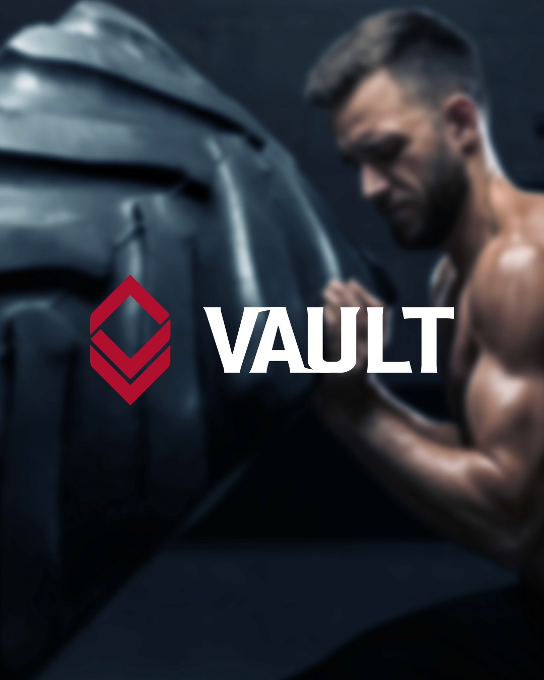
The goal was to create a mark that felt as strong and intentional as the training that would happen inside Vault's walls. I designed a geometric diamond symbol built from two interlocking chevron forms, a shape that reads as both a gem (something to protect and strive for) and a mountain peak (something to climb toward). It's simple enough to work as a standalone icon, but distinct enough to be instantly recognizable at any size, from an app icon to a storefront window.
I paired the mark with a bold, condensed wordmark, all caps and slightly aggressive in its letterforms, to reinforce the "rugged but empowering" tone I wanted the brand to own. The two elements work as a locked horizontal combination or independently, giving the identity flexibility across every touchpoint.
Color & Typography
The palette centers on Vault Red, a deep, confident red that carries energy and intensity without tipping into anything juvenile. I balanced it with Jet Black for grounding and contrast, plus two accent colors, Power Green and Heavy Blue, to give the brand room to breathe across secondary applications like signage, apparel, and digital touchpoints without ever straying from its core identity.
Typography combines Placa for headline impact with Semplicita Pro for supporting text, striking a balance between strength and clarity so the brand feels premium rather than purely aggressive.
I mocked the identity across the environments where a brand like Vault would actually live: on-body training photography, a smartwatch interface for a fitness app, storefront window signage, and a bold environmental graphic reading "ELEVATE" for a studio wall. The system holds up whether it's on a screen, etched onto glass, or wrapped around a training space, proof that the brand translates cleanly from digital to physical.


SERVICE
EXPLORE MORE PROJECTS
We craft interactive experiences, blending design, motion, coding, and strategy to engage users and elevate brands.